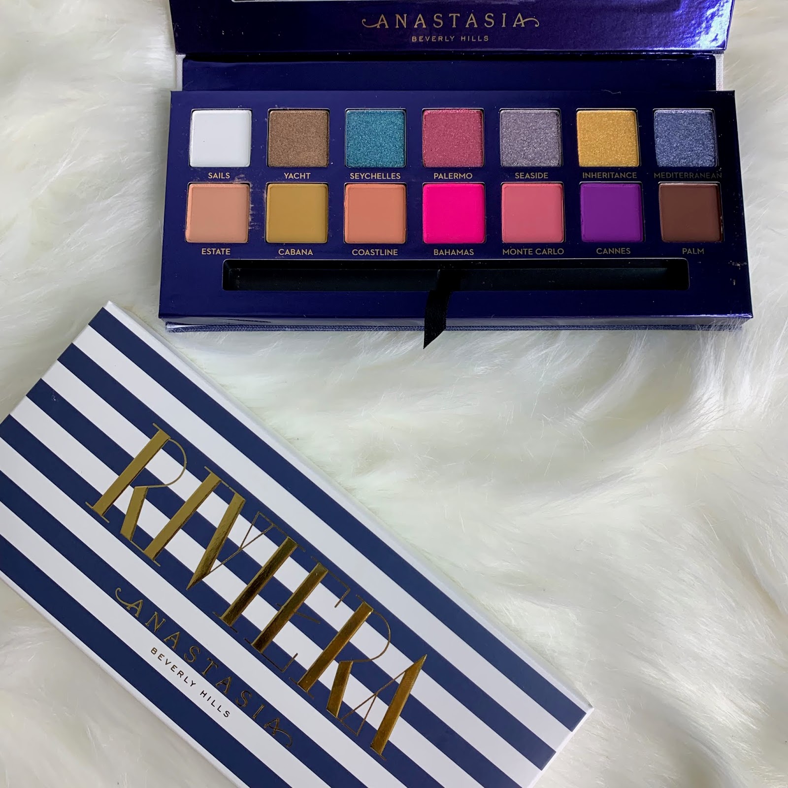
I have been using the Anastasia Beverly Hills Riviera palette for a week now, and finally had some time to sit down and write my thoughts on this palette!
This palette is SO refreshing to see from ABH! I think everyone was really ready for a colourful palette from ABH, and they did not disappoint!
This palette contains some really interesting formulas!
It contains:
- 5 normal matte shades
- 3 pressed pigment matte shades
- 2 duochromes
- 4 metallics
Firstly, I've never seen so many different formulas from ABH, so that's a great start!

Here are the swatches! I've actually put up live swatches on my instagram @mehshake, if you want to check that out!

I wanted to run through the formulas one by one, and explain how they work, and the best way I found to use this palette. It doesn't have just the traditional fomulas in this palette, as it incorporates pressed pigments, so I think this would be helpful!
Mattes
Initial thoughts: super buttery and are VERY similar to the traditional matte formula in other palettes.
Sails: the first matte shade which is a PURE matte white shades. Uh, I'm obsessed. I LOVE a good matte white shade for my base after a primer or concealer, and this is EXACTLY what I need. Especially when you're playing with colour, this shade is SUPER helpful.
Cabana: a matte mustard shade. Beautiful. This shade is super versatile, and can be used in the crease as well as all over the lid.
Estate: described as a soft pastel peachy pink, I'd say this runs more like a nude, which is a PERFECT transition shade!
Coastline: a matte pastel soft peach. Very similar to estate, but not quite. It's a few shades darker and although they're pretty similar, they're not the same! I feel like one of these could be replaced with a different colour matte, but I also am not complaining as it gives variety of the two 'pastel' shades!
Monte Carlo: a cool mid- toned pink. My fave shade in the palette so far. I'M OBSESSSSSED with cool toned pinks, and this palette just does it right! There's not many pinks in my collection like this one, and I am so happy with the uniqueness of this one!
Pressed Pigment Matte Shades
Initial thoughts: these pack a punch, but don't swatch very well! When applied to the eye, they need to be pressed down for maximum pay off, but also applied a few times to get the best application. They're not hard to work with at ALL, they just need to be applied differently. These shades are what takes this palette to 'artistry' level, but also if you're a beginner with eyeshadows, you'll get the hang of these formulas pretty quick, so no need to get overwhelmed! I must say, these do stain due to the nature of the pigment!
Bahamas: a matte hot pink! I don't have much to say but LOVE.
Cannes: a violet purple - this goes on so so so good with 2 applications. This shade all over the lid, with Bahamas in the crease is a LEWK.
Palm: a matte chocolate brown. This compliments alllll the shades so so so well! This shade was needed to bring all the shades together. LOVE.
Duochromes
Initial thoughts: love love love love love this. What I like about them is that they're not your usual duochrome shift colours. They are duos that I've never seen paired together with. When you own over 75 eyeshadow palettes, this is honestly appreciated.
Yacht: a duochrome mauvy taupe with a violet shift - OMG. When I swatched this, I have never seen a taupe compliment my skin so well before. The violet shift just makes it so so so good so if you have neutral to olive tones in your skin, you're going to love this one!
Seaside: a duochrome silver with a subtle blue shift - this pairs so well with so many shades in this palette and just gives me Riviera vibes. This is probably irrelevant but it reminds me of the outer packaging this palette comes in - the blue and white stripes. Norvina, is that what you were thinking with this shade? Pls confirm because am onto you and love you.
Metallics
Initial thoughts: buttery as usual! One swipe gives you great pay off, and VERY happy with the metallic selection in this palette!
Seychelles: metallic aqua marine. This shade makes me step out my comfort zone. I never wear blue on my lids, but maybe I'll do it now ha.
Palmero: metallic jewel pink. Not your usual pink, more towards a red than a pink, but I'm OBSESSED. I do feel like I can dupe this shade very easily in my collection, but still a nice addition to have in this palette!
Inheritance: metallic true gold. This shade was needed. If the brights in this palette overwhelm you, this is GREAT. It makes this palette such a good travel palette, because you can VERY easily to a natural gold smokey eye, but also colour it up when you need to. Love.
Mediterranean: metallic sky blue. More of a purple blue, but I appreciate that. In the pan it looks like a sea blue to me, but this is more of a wearable blue that I would not be afraid to wear AT ALL.
Final Thoughts
One thing I LOVE about this palette, is that although I think it's great for artistry make up, you could actually really also achieve a one swipe make up look with nearly all of these shades. What I mean is that most shades you can use just one shadow, and it'll look SO good. Especially the pressed pigments which are really bright!
I also prefer this palette to the Morphe x James Charles palette - I didn't like the formula of that palette unfortunately, but if I had to pick out of both, I'd choose this one (albeit more expensive)!
It's such a great travel palette, because like I said you can create a neutral look, as well as a very colourful look! The colour combinations are absolutely endless with this one!
Let me know if you have any questions about this palette, and I'd love if you come check out my live swatches on Instagram! Byeee.


Post a Comment